On first encountering Hugh Egan Westland and Blake Barns they seem a mismatched pair. While the designers look alike—both have a clear penchant for shrouding their statuesque frames in dark, billowing fabric; both balance these silhouettes by keeping their curly hair sedately short-cut—their dispositions seem markedly different. They are like co-ordinates from collections two seasons apart; antithetical, almost adversarial in their divergent constructions.
A gentle precision, even trepidation, guides the few spoken words Blake permits himself. Thoughts emerge slowly and judiciously from him, like well-placed stitches through a delicate skein. If his speech is careful his social ventures are even more so. Blake still hasn’t meet Hugh’s other closest friend in the five years the two have known each other. They have spoken once, briefly, on the phone, minutes before the showing of their shared fashion project, H.B. Peace’s first collection last month.
“Five years and that’s the first time my two best friends have met each other!” Hugh exclaims. “He’s a shy person, definitely not on the party scene,” he explains.
Hugh does not share this trait. Blake proposes, half-cringing at the cliché, that he is a “social butterfly”; an extrovert whose creative energies are fed through his outward endeavours. But while he is outgoing, he is no suck-up. He is forthright, often to the point of being brusque, and “opinionated”. He has, Blake says, a tendency to be “pretty harsh” sometimes.
Of course, they have characteristics that carry over, in the same way that the closures of two unalike trousers might be the same. It is their personalities, however, that distinguish them- the arrangement of these similar traits into contrasting patterns.
Their opinionated stances are matched only by their respect for one another’s viewpoints, ensuring that these innate clashes work together. Hugh respects Blake’s “headstrong” ability to “put him in his place”, and Blake respects that same transparency from Hugh. There is simply no room for “bullshit” between the two.
“You can’t be emotional about things,” Hugh says. “We’re very honest with each other.”
For Hugh, this openness represents not so much a willingness to bend to criticism as much as it is about being aware about all the possible “connotations” a viewer might find in his work. Blake’s criticism gives him the conviction to then “make up my own mind.”
“We’re not very sensitive,” Hugh says. “If Blake turns around and says that something I’ve made is fucking disgusting I won’t get offended.”
“And you were the same, with some of the material I wanted to use,” Blake adds.
Hugh nods, ”There were a few things that I vetoed and a few things that Blake vetoed,” adding, emphatically, “There has to be.”
In preparation for their first show, ‘Hey Blinky, you say chic, I say same’ this shared ruthlessness was essential.
The show was co-ordinated through Centre for Style, one of Melbourne’s newest fashion institutions, now an online store, that was hosted temporarily at creative space Fort Delta, in the CBD. The show was commissioned by young fashion entrepreneur and founder of the Centre, Matthew Linde. When Blake was initially contacted by Linde, he immediately thought of Hugh as a potential creative partner. Since studying fashion together, the pair has been close, contacting each other at least ten times a day, by “Instagram, email, or text message”. One day, Hugh received an uncharacteristically formal message from Blake asking him to meet him for lunch the next week, informing him, enigmatically, that he needed to talk to him about ‘something’.
“I was like, sure, but we’re going to talk about it a hundred times between now and then,” Hugh says. The pair then met and of course, Hugh said yes. While it was their first time working together, Blake says, “they weren’t really worried about that.” From their prior experience working alongside one another they sensed they would be an easy fit.
The starting point for the show was their interest in experimenting with the inherent characteristics of generic garments. Quotidian clothing items would be re-imagined, in unusual and often anti-functional fabrications and unfamiliar construction styles, in order to alter their inherent personality.
Hugh explains: “The characteristics of a garment are what we’re so familiar with, the idea that this is a suit, and this is what a suit should look like, and you understand what that is.”
“The difference between the character of a garment, say a pair of pants, and the personality– character is something which can be identified as a common point between things, whereas the personality can be completely different between you and me, but we have characteristics that are the same,” he says.
“That is what we’re interested in; when you make a garment, like an overcoat; when you do it in a lycra, or you do a jean in a lycra; the concept of the jean is the character, and by doing it in the lycra, it’s a personality twist on that,” he says.
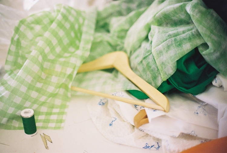
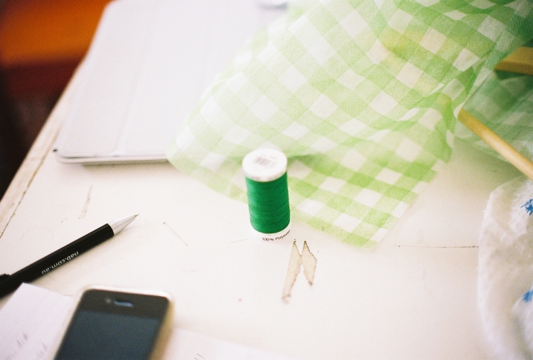
In the collection, trousers, jeans and coats are crafted from lycra, shift dresses from un-giving leather, boob tubes from soft flowing silk; tailored trousers hang in soft synthetic folds, and all are drenched in a pallet of lawn green, cream, black, juxtaposed against a scratchy, ephemeral print.
The collection was first planned to feature four looks, and eventually ballooned to a 31-piece, 12-outfit collection. Despite this spread the collection also came together through a lot of of editing, over a three-month period.
Their first step was to separately collect inspiration for a week after the first meeting; each was to come back with “seven images, one piece of text, and one song”. They set a rule that they weren’t allowed to talk about the project, but were allowed to talk about everything else; how could they help it?
Hugh came back with a half-speed, scaled-down version of “Thriller” by Michael Jackson, which ended up being the soundtrack for the runway show. A lot of inspiration material, however, was discarded along the way. “A lot of my images were Vincent Van Gogh style paintings of Simpsons characters, which obviously did not make it anywhere near this collection,” Hugh says.
His original concept for the Van Gogh paintings, however, survived; the idea of carving a pattern into leather, and then hand-painting over it to draw out the negative image. The leather pieces in the collection feature the same Australian marsupial animal print as the shirts, dresses, and shorts, and are decorated in white paint to emphasise their shapes.
Blake’s own pieces of inspiration for the collection didn’t always “stick to the rules,” says Hugh. He came back with twelve images, and six songs.
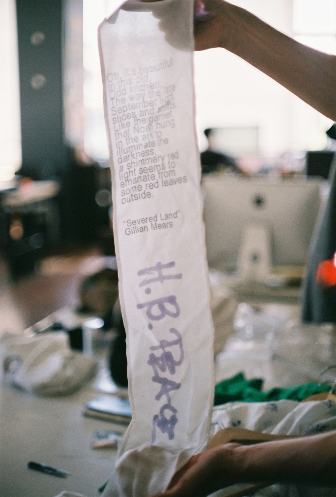
The quote featured on the scarves created for the collection was from one of the pieces of inspiration Blake brought to their second meeting.
It was sourced from the short story ‘Severed Lands,’ and was provided by Blake’s good friend, writer Gillian Mears.
“It’s from this collection of short stories from 1998,” Hugh says. “It’s about these two sisters that kind of hate each other, and it’s recounting this one interaction which recalls past interactions over their lives; they both assume certain certain qualities in the other, and they are just so let down by their expectations and the reality of who the other person is.”
While the work was not created for the collection, it is oddly fitting, “appropriate” Blake says, for the collection. The themes of the story; misinterpretation and misunderstanding, are linked with the collection’s own exploration of identity; how cultural ideas are transmitted, enforced and evolved through the conventions of clothing.
The pivotal piece of inspiration for Blake was the suit worn by Tippi Hendren from Alfred Hitchcock’s iconic film, The Birds.
After attending the recent Hollywood Costume exhibition at ACMI, he became “obsessed with the idea of ‘the birds suit’, but in a lycra.” This became the first piece constructed for the collection.
Currently employed at an opportunity shop, part of Blake’s job is sorting through “thousands and thousands” of discarded clothing items. “I’ve become obsessed with the tragedies of clothing, these garments that are discarded, and they won’t make it out into the shop because there’s something so fucked up and wrong about them.”
He was particularly attracted to home-made garments, “constructed with no understanding of the appropriate materiality for a particular purpose”; he found a certain charm in the naivety of the juxtapositions of garments with materials.
The idea evolved from there; for a collection made up of staple designs undertaken in unconventional fabrications. The collection contained only five fabrications, which is rare for such a large undertaking.
“In this collection everything is either made of lycra, cotton shirthing, silk jersey, leather, or acetate, so there’s only five materials,” Hugh says.
The first material agreed on by the two was lycra. “There’s just something really off about it,” Blake says. “It’s a bit perverted.”
“There’s a performance associated with lycra, it’s a dance fabric, and it’s really showy,” Hugh says. “It’s really versatile and it had to be really strong, you use it in all kinds of physical activities.”
“But the activity that it’s used for also has a kind of gracefulness, and so it’s not used to being seen in a situation where it’s not doing what it’s supposed to do,” Hugh says. “It’s body-hugging, it’s sports related,” Blake continues.
“It’s really stretchy, it’s really opaque… you never see it where it’s not revealing the shape of the human body,” Hugh says.
The idea of taking something like lycra, which has a strong aesthetic and physical link to its purpose, and divorcing it from these connotations became a key idea for them. “Everything we’ve done in lycra is so oversized,” Hugh says.
“Apart from the gloves and the socks,” Blake interjects. ”Which are really fucking weird anyway,” Hugh stresses.
It was, Blake says, both “interesting” and difficult “to play with; because obviously things were happening with this things that was intended for a stretch as a woven material,” he says. “Things happened with the material that we weren’t really anticipating.”
Lycra, as a stretch fabric, is less than inclined to being configured in a tailored finish, with a “beautiful fold” or “crisp line”, Hugh says. Blake, as the primary sewer, says the intention; to use lycra and make it behave like a more suitable fabric, made the process immensely difficult: (“it’s this constant struggle with the material, trying to make it do something that it doesn’t want to do.”) In order to achieve the appropriate look, the designers added silver-coloured metallic chains as weights to the seams.
Appraising the garments, Hugh says, required an extremely scrupulous eye. This vigilance was prompted, in part, by a shared self-consciousness– that their work be an “interesting proposition” rather than a “wrong one”, to avoid being condemned as mere “bad sewing”. They had to ask, Hugh says, “is it different and is that difference interesting and nice, or is it actually just a bad idea, and it looks ugly?”
This also required a certain “weird faith” in the audience, a trust in the the customer’s ability to “pick up on those points of interest and think, this is different, and this is interesting,” Hugh says.
Another theme of the collection was repetition, both in terms of materiality and print.
The print created for the show featured a range of different marsupial animals rendered in heavily cartooned, sharply-lined illustrations. These were then digitised and the same print applied through a variety of different methods.
“We’ve done it screen printed on the cotton shirthing, hand painted on the silk jersey, carved in the leather pieces, and then hand-painted and then screen-printed on the silk Crêpe De Chine which we then distorted with this gel,” Hugh says. “It was more about finding different ways to abstract one point.”
The print evolved through its various applications; on the Crêpe De Chine of the dresses the print is distorted beneath the gel beading to become abstract and mottled; on the cotton shirts it is often broken, doubled or smudged, on the leather it is savagely, deeply carved. The initially incidental imperfection of the different printing techniques was embraced as an instrumental part of their aesthetic. The local screen-printer the pair employed, Blake says, “didn’t have the facilities for doing metreage, but he did it any way, which kind of resulted in this slight doubling effect.”
This aesthetic appealed to both Hugh and Blake due to their mutual appreciation for points where, in vintage clothing particularly, “clothing departs from the repeated norm,” Hugh says. (“Every t-shirt might look the same but because this guy’s a hand printer there’s smudges, and there’s faded points where the paint didn’t come through, and that’s the point that we like, probably more than something that’s incredibly uniform.”)
The print itself emerged through a collaboration between the two inspired by procedural guidelines they’d experimented with at fashion school. The story Hugh tells emerges with a certain autobiographical forthrightness he is prone to.
“We had this teacher in second year (university) and she ran a design class, and she absolutely hated me and I didn’t have a whole lot of love for her,” Hugh says bluntly. “Blake and her were probably much better acquainted, I was just maybe a bit precocious.”
The project that inspired him was one where each class member was given a small figurine, and then had to close their eyes, and draw it. They adapted the project to a process where Blake gave Hugh a series of verbal stimuli to draw from, blind. This process was simultaneously abetted by their mutual interest in an illustrated wildlife book from the 1950s entitled Doris Rides a Rhino which featured accounts of the eponymous woman’s safari trip. The book featured photographs of a society woman “dressed in stunning clothes, but standing next to a rhino.”
This kind of interesting juxtaposition, of wildness against civility, comic relief against control, is reflected in the interesting contrast of the print to the simple shapes and plain silhouettes of the collection.
Rather than being the singular vision of a lofty genius figure H.B. Peace exemplifies the plurality and collaborative potential of fashion. Outsourcing elements of the process required the two to have a humility about their abilities in their engagement with professionals they respected.
“The whole process we have relied a lot on friends and other people who know more about what they do than we do, and coming up to them with ideas, and them showing us how to work with the limits of that request,” Hugh says.
Hugh and Blake’s friends, Audrey Thomas Hughes, created slip-on shoes for the collection. Due to their limited knowledge about the physics involved in the construction of this item, their creation was inextricably linked to an interdisciplinary discussion. This humble approach was also necessary to their development of the print, as Blake’s friend Tim Dawes digitised the drawings, and another friend screen-printed the garments.
The poem that Hugh brought as his piece of inspiration formed the basis of the name of the label, which also came to embody this collaborative spirit.
“It’s from this poem by W.G. Sewell, ‘In early November 1980/walking across the bridge of peace/I almost went out of my mind,” Hugh says.
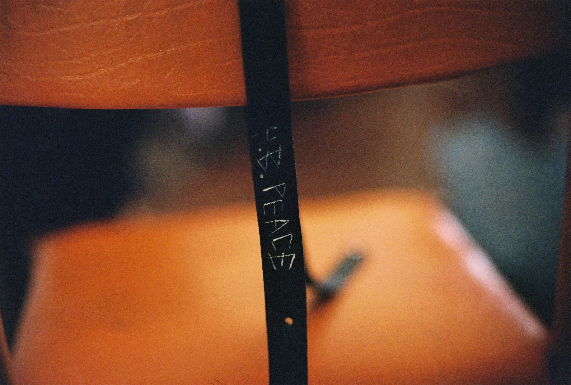
Peace, that thick word pleated with its manifold manifestations, interpretations, and permutations, both corporate and activist in nature, became one half of the moniker of the fictional H.B. Peace.The other half of the label’s name encompassed the initials of the two primary designers behind it.
The name was also inspired by Hugh’s previous project, where he had “this idea about this kind of pseudonym character designer, this idea of a fictional designer,” Blake says.
“Having something like a pseudonym helps if you want to divorce some of the qualities you have in a partnership,” Hugh explains, where neither one is or wants to give all of themselves.
Having neither of their names associated explicitly allows each of them to feel comfortable working independently of the other under the title, and to employ and integrate others beneath it. He quickly adds, that of course, under the name, everyone is credited. Eager to sound reasonable, but not pedantically so, Hugh stresses “Blake and I never bean-count our projects, but Kate Meakin did a video for us and Kate Meakin is credited.”
Kate Meakin, a video, sculptural and installation artist working out of Melbourne, completed a video for the project. The video features a model wearing a papier mache mask, dancing slowly and dreamily to a haunting guitar ballad. The mask is removed and the camera slowly centres on the model, who wears a coat and slip dress from the collection; the gaze shifts to a closeup of the print on the silk, which shifts and furls rhythmically.
While the parts are always carefully demarcated Hugh says H.B. Peace is in essence the central symbol that “can take responsibility for the whole.”
The show’s title, ‘Hey Blinky, you say chic, I say shame,’ came from a dream of Hugh’s. Rather than being something whimsical and surreal, the dream was, in Hugh’s trademark style, absurd and comic.
“I had a dream that I was best friends with Blinky Bill; I was in this situation where someone said ‘Hey Blinky, you say chic, I say shame,’ and me and Blinky Bill made it into T-Shirts,” he says.
The reference, which he admits is “far-out” became the name almost accidentally; Hugh was creating the Facebook event for the show, and a name hadn’t yet been decided on, so he came up with it on the spot. “I don’t even think Blake knew about it!” he admits.
“I think it in the same way it relates nicely to the repetitiveness of the shapes and the repetitiveness of the prints and the banality in a lot of the shapes of the clothes,” Hugh says.
“And the humour in the collection, as well,” Blake adds.
“I guess there is definitely a lot of humour to it, like in the gloves, and the fucked up little marsupials,” Hugh muses.
The gloves created for the collection were crafted out of green lycra. They cover the two forefingers, and fasten over the hand with an elasticised lycra band. The gloves are ludicrously anti-functional, or perhaps even more humorous in their imagined purpose, in a characteristically playful gesture for the design duo.
Their process evolved through an interplay of their key strengths. When it came to constructing the garments, Hugh is quite self-effacing about his role; “I’m there, motivating- Blake is much better at sewing than me.”
Not one to be bashful about his achievements,though, he is fast to reel off his other credits; “I did all of the things by hand, the hand fabric carving, the gelling of the dress, the hand painting of the silk jersey, I sewed on the chains.”
The machine sewing was challenging for Blake, even as an avid machinist.
“It took me about four of these jackets to feel that I was confident,” he sats. “Sewing this material, you can’t pull it.”
“You can’t iron it, either,” Hugh sighs.
Blake agrees. “You can’t press it because it melts.”
Hugh had the idea from the beginning to French seam all of the clothing. French seaming is a strenuous process by which all raw edges of fabric are enclosed, instead of just one.
“When we first started we thought it would be funny as well if we French seamed everything, so it was this really high-end, laborious finishing technique on these garments,” Hugh says. Some of the garments are still finished with this technique, however others are not.
Hugh was resistant to overlocking the garments, preferring to use his chosen elaborate technique, until Blake convinced him otherwise.
With a sigh of resignation Hugh admits that, “I have learnt that in an oversized lycra t-shirt dress, it looks a lot better when it’s overlocked, because that’s how the fabric likes it, where I wanted everything French-seamed, and French seaming takes twice as long,” he says.
“So when were sewing these we had to pin every probably two centimetres so it didn’t slip,” Blake says, exhaustedly.
“I learned my lesson,” Hugh says.
The colour pallet for the collection also came together reciprocally. While Blake favoured a pink pallet, Hugh was more interested in exploring a more obscure, though recognisable shade.
“I was just obsessed with the Sriracha chilli bottles you see in Asian restaurants, they’re clear and they’re full of red, and it’s nearly exactly that green on the bottle top,” he says. The strange ubiquity of this colour appealed to Hugh.
“We also realised recently that this was the green that they used for green-screen stretch costumes,” Blake adds.
Hugh says, “This iconic suit from The Birds is in green. I guess that’s why it started sticking.”
The show itself was structured, partially due to their limitations, in a highly innovative format. Originally, the show was going to be hosted at Centre for Style’s shop site, however the shop closed before the collection was ready.
The original plan for that space was to have the individual audience members’ positions marked out close together. The idea was tor replicate the experience of encountering other people’s garments at a party; in a crowded room, where, Hugh says “you have to brush really close past someone and you have to turn your body to the side to get between people.”
“We were into the models having to do that, where you almost see the clothes, but you don’t see the clothes, but you feel them, and it’s quite a sensory experience, Blake wanted the models to have a smell; which I think was tiger balm.”
“It would be this experience where you’re touching them, you’re seeing them you’re probably hearing them; you’re getting your breath; you’re getting their smell.”
The idea also aimed to integrate Hugh and Blake’s shared notions about the “democracy of fashion”.
“It sounds wanky,” Hugh says. “I didn’t want it to be like, only certain people have to be invited, I thought, I wanted everyone to— not necessarily to participate,” he stops himself, before adding, self-consciously, “I’m not that twee, but would be nice that everyone see the show, and everyone be invited.”
The idea, however, was conditional to the more condensed space Centre for Style was previously situated in.
The show ended up being hosted by World Food Books, a contemporary art and design shop located in Melbourne’s CBD.
“The boys at World Food Books were really good to us, they let us do whatever we want with their shop, they didn’t care that we were potentially hijacking the Nicholas building’s fire escape for the show,” Hugh says.
The Nicholas Building, a “beautiful” Chicago-style structure in the city’s CBD, appealed for the two designers; “you so rarely get to appreciate certain aspects of it,” Hugh says.
Their appreciation for that staircase was one of these aspects which inspired the format for the show. By utilising the entire staircase the space could be democratised in the same way, where the audience could be spaced, step by step, so everyone could get a “good glimpse”, Hugh says; (“there’s three levels, you get different approaches, you get different angles, rather than just one view as it brushes past.”) As the models poured down the stairs each audience member was treated with a singular viewpoint, while simultaneously being able to see the looks before and after in order to contextualise them within the whole of the collection.
While World Food Books deals primarily in art-based media, both Hugh and Blake approach H.B. Peace with a “’very fashion’ attitude,” Hugh says.
“It’s repeatable, it’s commercial, there’s no limits on how many times we’re going to do it, except for our physical endurance capacity, so I’m not doing those leather things again, Blake’s not doing those leather things again, I’m not doing those gel things again, but that’s just a choice we’ve made, that’s not like an artistic idea,” he states, plainly: “I’m not spending three months of my life doing that again.”
“I don’t consider any of them art,” he says. “What I do consider, maybe, is if someone took a garment, and photographed it in a certain context, maybe someone else can take something from it, but by themselves I consider them as pieces of design.”
As such, to make the collection commercially viable the show featured feminine garments worn only by feminine models. This decision was not altogether conscious, but perhaps ingrained by the nature of the fashion industry in the small industry context of Melbourne.
Hugh looks at it practically; “Women buy more clothes and more adventurous clothes than men do, if we want to do a project that’s a little bit left of centre, we want people to be able to buy it, I don’t want this to sit in a suitcase for the rest of our lives.”
Blake’s view of his decision is also quite pragmatic; “I’ve personally never done men’s wear as well, all my training is in women’s wear; I feel there’s more freedom there, which is maybe completely a self-imposed idea.”
While they are very explicit in their collecton’s identity as design, and not art, it still suggests something personal about each of them, something inextricably linked to their own senses of style.
Blake suggests that this continuation is merely “inevitable.”
“Definitely it permeates,” Hugh says. “Everything is quite big. Me and Blake are not tight-clothes-wearing people.”
It also suggests, he says “our attitude to the way in which we dress ourselves; this discarded imperfection.”
“But if someone who’s really done up and wears makeup every day, like Alannah Hill wanted to wear a piece our clothing she could, and she could wear it with her style, and it would become something else,” he says.
The attitude with which they dress themselves, with an emphasis on “relaxation” is what figures most prominently in their shared designs, Hugh says. They also have a shared interest in integrating and appreciating different levels of fashion.
Blake says, “We have this appreciation for things that are discarded or imperfect.”
“Hugh got these amazing series of clothing that he’s found discarded in the swamp in Alice Springs, which were sun-bleached, and salt crusted; but then we love high fashion as well.”
“We appreciate the conversions of those two things, there’s qualities that you would want to repeat in a garment that’s been plucked from a swamp, that’s been there for months, and there’s also parts of a Dior couture outfit that we have this emotional quality to it which is something maybe we would want to borrow from,” Hugh says.
“As Blake said, with all these things he picks up from the op shop, it’s almost like a little life story comes out of it,” Hugh says.
Recently, after the completion of this project, the pair have separated, as Hugh has gone to London in order to complete an internship at a small fashion house. They do, however, plan to continue the project, but they’re as of yet unsure of what form it will take. H.B. Peace as a liminal entity, not quite a fully-fledged label, and not tied directly to either of their names, allows for a range of potential growth.
“I was afraid if we called this a label, we would become tied to this expectation of how labels work, how, twice a year, they present collections for sale,” Hugh says.
Rather than having this kind of professional attachment to Peace, they took a more flexible approach, allowing that “maybe if we find ourselves with a good idea when were in the same city, with time, and drive, let’s do something, but let’s keep it a very fluid practice,” Hugh says. This would allow the possibility for independent work under the same label, or cross-continental dialogue.
”I think that’s been liberating through the entire process, because we haven’t had this pressure,” Blake says.
Hugh continues, “We do have ideas for another project, but I’m going overseas in a week, so it’s very…”
“Up in the air,” they state in unison. While they may not be together for some time, their shared creative vision will continue to exist; representing a chapter of their “life story” beneath the title they have befitted themselves.
You can see more items from H.B. Peace’s first collection on the Centre for Style website, here. Kate Meakin’s short film, H.B Peace Movie can be viewed here.